
In our previous blogpost The Big Picture - Connecting Strategy to Architecture, we identified Technology Diagrams as an important artifact during Transformations.
A technology diagram is helpful in the following digital transformation scenarios:
- Mergers and acquisitions where digital products/services have overlapping or similar features
- Splitting a monolith to understand what component/services belong to specific business domains
- Explaining to Executives how different components interact and where technical debt exists
What is a Technology Diagram for Business Stakeholders?
Most Technology Diagrams are designed by Engineers for Engineers. Technology Diagrams for Business Stakeholders or non-Engineers are designed for the rest of the organization. The goal of these diagrams is to bridge the communication gap between 'The Business' and technology.
In Transformations, another goal is to show the current state and one or more future states. As such, diagrams need to be artistic enough to tell the right story.
To create an effective diagram for non-technical stakeholders, we use several techniques.
- Group in layers such as users, user interfaces, business logic, and data persistence
- Organize left to right to show processes or journeys
- Only use arrows or connecting lines to show data flow
- Use animation with more than a dozen objects on the diagram
- Consider printing on a large format printer - at least 11" x 17"
- Consider a hierarchical numbering scheme to tie the drawing to other artifacts
- Avoid technical terms as much as possible
- If you need acronyms, use a legend or reference key
- Use red/yellow/green colors to show health or risk
- Use different shades of 1 color to show relative differences
Let's look at examples of each of these techniques.
Grouping in Layers
This technique is common among Engineers. Engineers think in layers. Yet, it may be a new concept for technical stakeholders. We like to see 4 layers - from top to bottom:
- user groups
- user interfaces
- modules or business logic components
- persistence stores (e.g. databases)
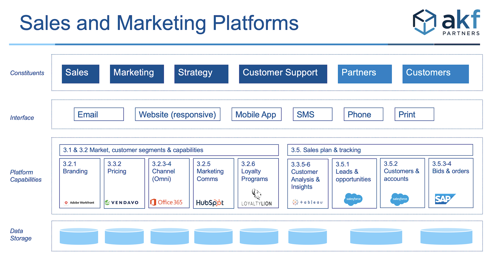
Most engineers only think of the last 3 layers - what they build and maintain. Business stakeholders can understand who uses a device or application. Engineers need to make the connection to the end customer or user. The following example is a common layout designed for a landscape screen or print:
SaaS companies should consider a numbering scheme to connect a diagram to a large feature matrix. Recall that a feature matrix is useful to show what features/capabilities are important to different personas. In these situations, the numbering scheme is arbitrary. Industry standard classification schemes typically do not apply.
Technical Terms and Acronyms
Avoid technical terms wherever possible. These diagrams are for non-technical audiences. If the audience doesn't understand a technical term, the reader will get confused or ignore the content.
Acronyms are often needed. Acronyms are usually known by long time employees. We still recommend using a Key or Legend for acronyms. The audience is large. The likelihood that everyone in the intended audience knows all acronyms is small.
Using Colors and Heat Maps
Different colors and different shades of a single color add another dimension to the diagram. The general rule is to pick only one of these options:
- Use Red/Yellow/Green to show risk or health.
- Use different primary colors to show different business domains
- Use different shades of 1 color to show relative size or quantity - not related to risk or health
How to Create these Diagrams
These diagrams should look like they took a significant effort to create. However, you should create these as quickly as possible. The knowledge to create these drawings is in the noggins of several technical and non-technical experts.
These are the primary methods to capture the information needed to create these diagrams:
- Individual interviews - usually the least efficient method
- Group interview - using a list of systems, ask the group what connects to what, what flows, who uses the system, what is working, and what i not working
- Event storm - usually reserved for Domain Driven Design, event storms captures a great deal of information very quickly. The event storm evolves to a logical left to right flow.
When to Create these Diagrams
We described the Transformation scenarios at the beginning of this article. We are also proponents of Agile. Agile does not eliminate technical diagrams - but favors working software over documentation. Agile does find documentation important. As such, consider creating these diagrams in these scenarios:
- Onboarding a Product Manager. Product Managers are often business stakeholders but lack technical skills.
- Splitting or merging a service. After an event storm for a Domain Driven Design session, additional diagrams may be needed. More technical diagrams may be needed. Use the non-technical aspects listed above to stay focused on business outcomes vs engineering dogma.
- Getting different teams on the same page. When an interface is needed, a diagram may be needed to see actors, information flow, services, etc.
How AKF can help
If you need help creating these diagrams, we can:
- teach you how to create them in a short amount of time.
- help you avoid wasting hours on the artistic or engineering side.
- help you identify the risks in the current state.
- help you model the future state focused on business outcomes.
Contact us at AKF.